

Somebody Chose the Butterflies
A field study of how two AI companies engineered a feeling, and what a builder can learn from it.

The Observation
I want to start with something I cannot fully explain.
When Anthropic launched Claude Fable 5 in June, I watched the launch visuals and felt something. Not the feeling I usually get from a model release, which is somewhere between curiosity and benchmark fatigue. Something closer to what a well-made book cover does. Butterflies. For Sonnet 5, it had been flowers. For Claude Code, a tiny pixel creature called Clawd that lives in a terminal and somehow makes a command line feel like it has a soul.
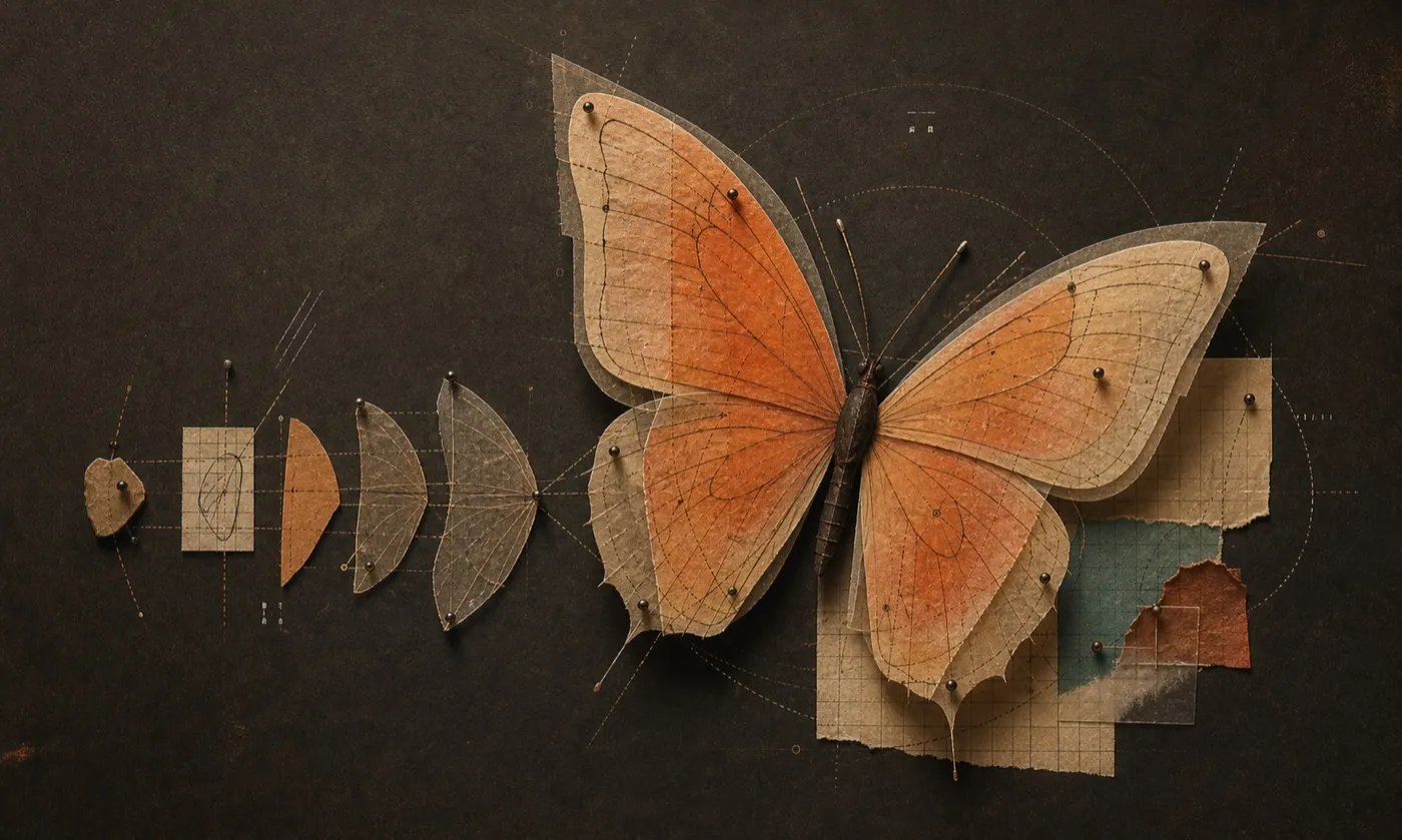
Original illustration: the finished feeling, with the system still visible underneath.
I found myself admiring a team I have never met, for work I could not name the discipline of. And when I opened OpenAI’s latest release page for comparison, I felt nothing in particular. Clean. Minimal. Impressive, even. But nothing that stayed.
This bothered me, in the productive way. Both companies sit at the absolute frontier of AI. Both employ world-class designers. Both invest heavily in how things look. So why does one of them consistently make me feel something, while the other makes me feel that I have arrived at a very well-organised airport?
I am an engineer. When something works on me and I don’t know why, I take it apart. This is my field study: how I studied it, what I found, and what I am stealing for my own work.
The Question
The question, stated properly: can a feeling be engineered, and if so, what does the engineering look like?
The lazy answer is taste. Anthropic has it, the argument goes, and taste cannot be studied. I don’t accept that, for the same reason I don’t accept “some engineers are just good” as an explanation for reliable systems. Behind every output that looks like magic, there is usually a system that looks like work.
So I went looking for the system.
The Method
Full disclosure, because this piece is partly about a company that prizes the word unvarnished: I did not read everything myself.
I asked Claude, specifically Fable 5, the very model whose launch visuals started all this, to sweep everything public on both companies: the case study from Geist, the Portland studio that built Anthropic’s original identity; interviews with Anthropic’s brand and design leaders; the coverage of OpenAI’s 2025 rebrand, including interviews with its own design leads; the campaign records for both companies. I then read the key sources it surfaced, pushed back on its framing, and rejected two full drafts before this one because they didn’t sound like a person.
So the reading was shared. The feelings, the interpretations and any mistakes are mine. Sources are listed at the end, and there is something fitting about studying how a company engineered a feeling while working alongside the machine it built. What follows are the five findings that survived.
Finding 1: The feeling was designed before the product existed
This was the fact that reframed everything else.
Anthropic worked with Geist for two and a half years, starting in stealth mode, before Claude ever launched, partnering directly with the founders on a brand meant to stand apart in what the studio called “a category rife with tech tropes.” [1] Not a logo project. Messaging, illustration, colour, typography, interface components, even the CMS (content management system) the site runs on. The wordmark’s single flourish, a slash, was chosen to reference the code beneath AI.
Read that timeline again. The feeling I got from the Fable 5 butterflies in 2026 was specified, in its essentials, long before Claude’s 2023 launch. Before there was a product, there was a decision about what the product should feel like.
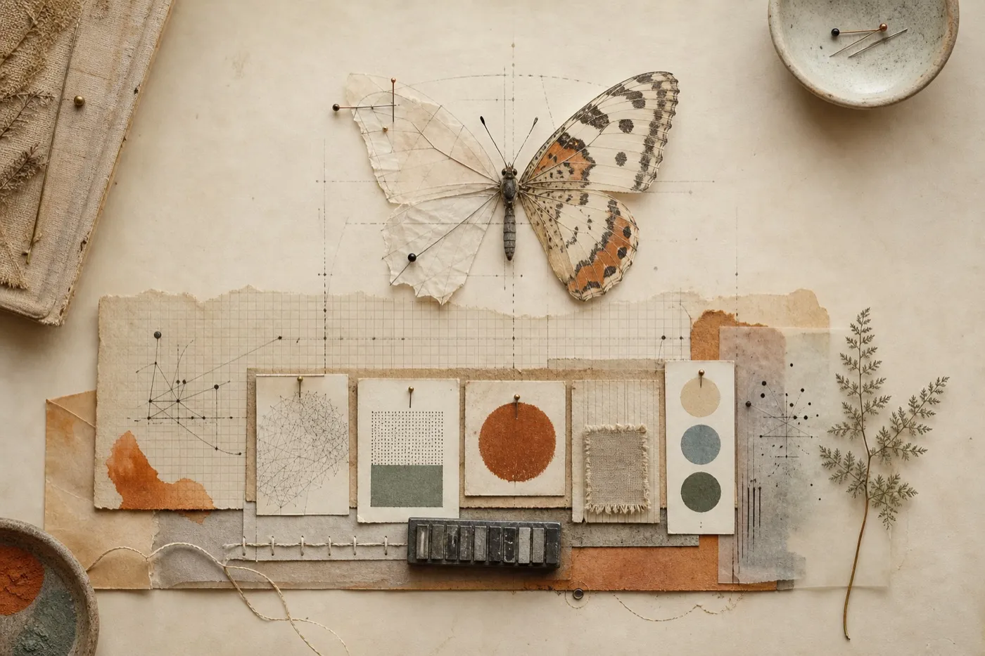
Original illustration: the brand foundation precedes the finished form.
Every engineer knows the software version of this. Conventions written before the first commit hold. Conventions bolted on at version 4 fight the codebase forever. Anthropic wrote its conventions first.
Finding 2: The system runs on adjectives, not hex codes
Here is the mechanism that makes the feeling repeatable across videos, websites, terminals and billboards.
Anthropic’s brand team works from four words: intelligent, warm, unvarnished, collaborative. They began as writing guidance. The team then deliberately promoted them into principles for all expression, so that animators now ask what unvarnished means for motion and illustrators ask what warm means for a drawing. Head of content Chelsea Larsson puts the third word bluntly: “We don’t want corporate gloss if it hides what’s underneath.” Creative director Tim Belonax describes the palette through unfired clay and the illustration style through the doodles you make while on the phone. [2]
This matters because of a limitation every engineer will recognise. A style guide, like an API specification, only covers the cases someone thought of. Adjectives generalise. When a designer faces a surface nobody anticipated, a launch film, a loading animation, a butterfly, they don’t need a rule. They need to ask whether it feels varnished. The four words are not a description of the system. They are the system.
The organisation protects this deliberately: content and brand at Anthropic are centralised functions working across product, web, marketing and education, so the same small group keeps the grammar coherent everywhere it appears. [2]
Finding 3: The names are doing engineering work
This is the finding I care most about, because I am a writer, and I nearly missed what I was looking at.
Anthropic names its models after literary forms: Haiku, Sonnet, Opus. Notice the ladder. A haiku is the smallest, most compressed form in poetry. A sonnet is mid-sized and strictly structured. An opus is the grand, complete work. The capability tiers of the models are encoded in the sizes of the forms. That alone is lovely.
But with the fifth generation, the naming crossed from forms of poetry into forms of story, and it stopped being decoration. Anthropic’s new frontier tier is called Mythos, and its models were initially restricted to a small circle of trusted partners because of what they can do. The version released to everyone in June 2026 is called Fable 5, which Anthropic describes as a Mythos-class model made safe for general use. [3]
The release note goes further than I expected. Anthropic states it outright in a footnote: fable comes from the Latin fabula, “that which is told,” akin to the Greek mythos, and the safeguards are why the two models have different names. [3] The naming is not decoration applied after the engineering. The naming encodes the engineering.
In my reading, Mythos names the raw body of story. Fable names the story after it has been given a boundary and a moral.
Sit with the words. A mythos can be inherited, sprawling and dangerous. A fable is bounded: a story shaped to carry a lesson. The names are not merely describing the products. The names are the product architecture, translated into literature. Somewhere in that company, someone decided that even the safety model deserved a metaphor, and then found exactly the right one.
That is the moment my admiration stopped being vague. You do not get names like that from a branding sprint. You get them from an organisation where writers are in the room when the engineering decisions are explained.
Finding 4: The imperfection is deliberate, on both sides
I expected this study to flatter Anthropic and dismiss OpenAI. The reading did not cooperate.
Start with the idea at the centre of OpenAI’s 2025 rebrand, built in-house with type foundry ABC Dinamo and motion studio Studio Dumbar. It is a single black circle, and they call it the point: the cursor that blinks before ChatGPT answers. A datum. An origin. The moment before the response arrives. That circle is then drawn into every letterform of the custom typeface, so the whole alphabet is built from the instant of waiting. [4]
I want to be honest about this, because it would be easy to skip past on my way to a conclusion I had already decided. That is a better idea than anything I have ever named. It takes the most ordinary object in the product, the blinking cursor, and finds the poetry that was sitting inside it the whole time. Anthropic’s slash is elegant. OpenAI’s point is profound.
And buried in the execution is the same instinct I admired at Anthropic. The capital O of OpenAI Sans is perfectly circular on the outside and subtly irregular within, a deliberate imperfection against robotic precision. One of the system’s four stated values is, literally, imperfection. [4]
So both companies know the secret: perfection reads as machine, and a trace of the hand reads as human. Anthropic turns that dial to maximum, with clay colours and doodled illustrations. OpenAI applies it homeopathically, a flaw hidden inside a letterform, invisible unless you go looking.
The difference is not knowledge. It is dosage. Which raises the real question: why would OpenAI, knowing what Anthropic knows, choose to feel like less?
Finding 5: OpenAI’s blankness is a strategy, not an absence
The answer is scale, and sequence.
ChatGPT escaped the lab as a research experiment and became a global default before the company had a unified identity. By early 2025, OpenAI’s own design leaders described the accumulated result honestly: a jumble of fonts, marks and colours, six or seven typefaces in use, around 300 million people served every week. Sam Altman personally asked for the fix. [4] Anthropic designed its identity before scale arrived. OpenAI is refactoring its identity underneath scale, live, which is the hardest migration there is.
And OpenAI’s minimalism serves a theory. Its identity has to stretch across a research lab, a consumer app, developer platforms, video models, enterprise products and, soon, hardware being developed with Jony Ive. A quiet, neutral frame reduces collisions across all of it. OpenAI is designing a stage on which anything can happen. Anthropic is designing a character you are meant to recognise anywhere.
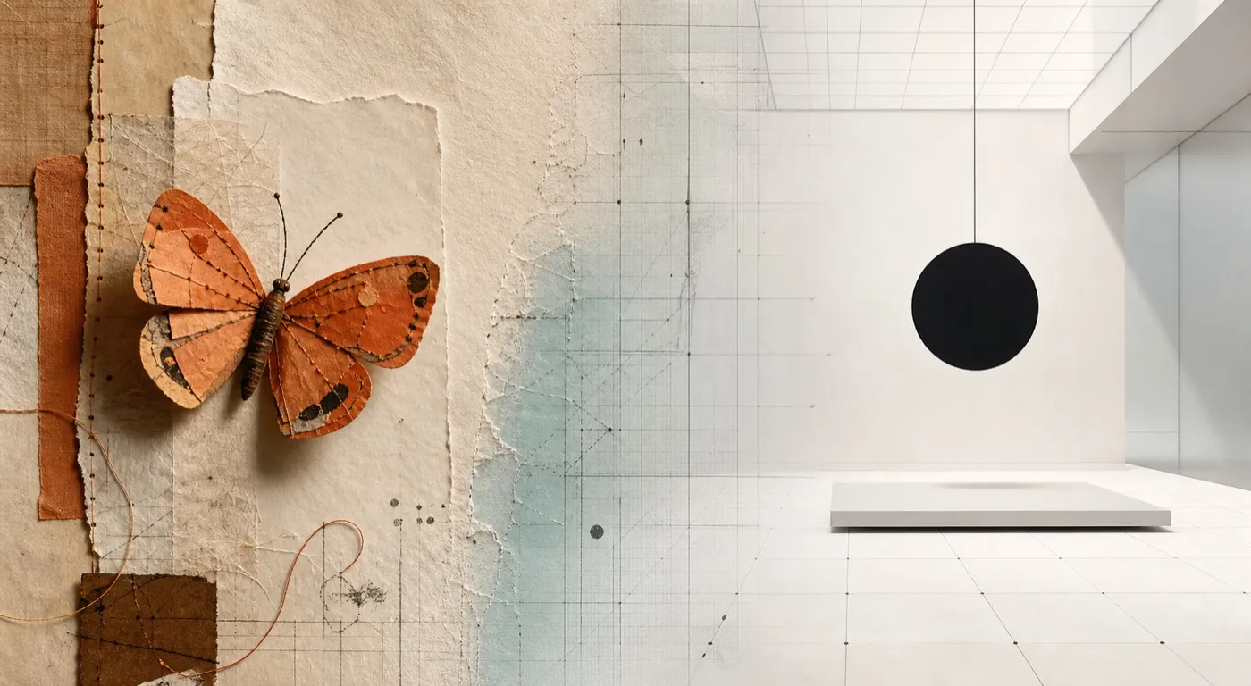
Original illustration: a recognisable character and a neutral stage are two valid systems.
A stage and a character are both valid designs. But only one of them gave me butterflies, because a stage, by definition, is not supposed to be what you remember.
There is one more piece of evidence that Anthropic’s character runs deeper than visuals. The company’s head of design describes Claude itself as intended to be “a sparring partner with you,” built to push back rather than obey. [5] And when Anthropic finally bought advertising, its first campaign, Keep Thinking, framed Claude as a thinking partner rather than a shortcut, and its first Super Bowl spot used advertising’s biggest stage to question whether advertising belongs everywhere. [6] The feeling is consistent because everything, the model’s behaviour, the mascot, the media strategy, is downstream of the same few decisions.

Claude Code’s terminal mascot. Anthropic’s design, reproduced here as commentary.
What I’m Taking With Me
I did this study for my own sake, so here is what goes into my notebook. These apply whether you are building a product, a brand, or, as I am, a small library on the internet.
Turn the idea into a working system: I made a companion guide, How Should Your Product Feel?, with six exercises for translating a few honest adjectives into decisions across voice, visuals, motion, naming, and product behaviour.
Write the adjectives before the code. Anthropic chose warm and unvarnished before it had anything to sell. Decide what your work should feel like before you scale, because the things you don’t decide early get decided for you by accretion, and then you are OpenAI in 2025, consolidating seven fonts under 300 million users.
Principles travel further than rules. A style guide covers the cases you anticipated. Three or four honest adjectives cover the cases you didn’t. If a new page, post or feature can be tested against the words, the system will hold surfaces you haven’t imagined yet.
Name things like a writer. Haiku to Sonnet to Opus to Fable is proof that a naming scheme can carry meaning, scale, and even architecture. The cheapest place to add soul to a technical system is its vocabulary, and it costs nothing but thought.
Decide how much of the making you want people to see. This is a dial, not a look. Anthropic turned it up and you get clay and doodles. OpenAI turned it down to a flaw hidden inside a letterform. Both chose deliberately, and both are defensible. What is not defensible is never choosing, and letting the polish of your tools decide for you. In 2026, work that shows no trace of a maker reads as machine-made, and that is no longer a compliment.
The product is the brand’s proof. Butterflies would mean nothing if Claude behaved like a vending machine. The feeling holds because the model’s character, the mascot’s charm and the campaign’s argument all say the same thing. If your product contradicts your story, the product wins, and it should.
Coda
I said at the start that I couldn’t fully explain the feeling. I think I can get closer now.
The butterflies moved me because they were not decoration. They were the visible end of an unbroken chain of decisions that started in a stealth-mode startup years before I ever typed a prompt: four adjectives, a slash, a palette of unfired clay, a naming scheme that treats engineering as literature, and an organisation arranged so that none of it drifts.
Somebody decided, long ago, that intelligence should feel like this. The butterflies were a decision.
That is what I find genuinely inspiring, and genuinely stealable. Not the orange. Not the serif. The discipline of deciding what your work should feel like, early, in words, and then refusing to ship anything that breaks the promise.
Engineered by Gaurang is my reading room for technology, systems and stories, a place to understand not just what we build, but what our machines reveal about us.
Sources & Notes
[1] Geist, “Anthropic” documents the two-and-a-half-year engagement from stealth mode to the launch of Claude, the early partnership with the founders, the slash as a reference to code, the dual-purpose colour system, the illustration language and the component and CMS work.
[2] The Subtext, “Anthropic Brand Team Interview” with head of content Chelsea Larsson and creative director Tim Belonax covers the four principles (intelligent, warm, unvarnished, collaborative), their promotion from voice principles to principles for all brand expression, the unfired-clay palette, the doodle-like illustration style and the centralised content foundations team.
[3] Anthropic, “Claude Fable 5 and Claude Mythos 5” describes Fable 5 as a Mythos-class model made safe for general use, with the unrestricted Mythos 5 available to a small group of cyberdefenders and infrastructure partners; TechCrunch covers the launch and the initial restriction of Mythos to selected partners. The etymology and the statement that safeguards are what distinguish the two names are Anthropic’s own, given in footnote 2 of that release. The reading of mythos as raw story and fable as bounded story is mine.
[4] Wallpaper, “OpenAI has undergone its first ever rebrand” covers the pre-rebrand jumble of fonts and marks, Sam Altman’s request, the in-house team under Veit Moeller and Shannon Jager working with ABC Dinamo and Studio Dumbar, the point, OpenAI Sans, the deliberately imperfect interior of the O, and the values of simplify, space, imperfection and vivid.
[5] Fast Company, “Inside Anthropic’s biggest design choices” features head of design Joel Lewenstein on Claude as a sparring partner designed to push back.
[6] Campaign, “Anthropic launches first work with Mother” documents Keep Thinking, September 2025, as Anthropic’s first paid advertising after four years of organic growth; Mother London describes Anthropic’s first Super Bowl campaign as asking whether advertising belongs everywhere.
A note on the launch visuals: I checked both motifs against Anthropic’s official release pages. Fable 5 uses a number five composed of butterflies; Sonnet 5 uses a botanical floral illustration. The three editorial plates in this article are original illustrations, not reproductions of either company’s artwork. The terminal figure is the exception: it depicts Claude Code’s own mascot, reproduced here as commentary and credited to Anthropic.